Introducing sleyt — A Minimal CSS Framework with Glass Morphism
Why I Built It
I wanted a lightweight, simple CSS framework for my own projects, so I built one.
It focuses on being small, pure CSS with no JavaScript runtime dependency, and a modern visual design.
Some components and flexibility gaps remain, but it works well enough for practical use.
See the documentation site for full details.
Component Library
sleyt ships 20+ ready-to-use components split across four directories:
Components (src/components/): accordion, alerts, badges, buttons, cards, charts, code, forms, modals, navbar, navigation, progress, prose, sidebar, spinners, showcase, swatch, tables, tabs, tooltip.
Layout (src/layout/): container, dashboard, flexbox, grid.
Base (src/base/): reset, themes, variables.
Utilities (src/utilities/): spacing, colours, typography, borders, effects, glass, display, position, transforms, transitions.
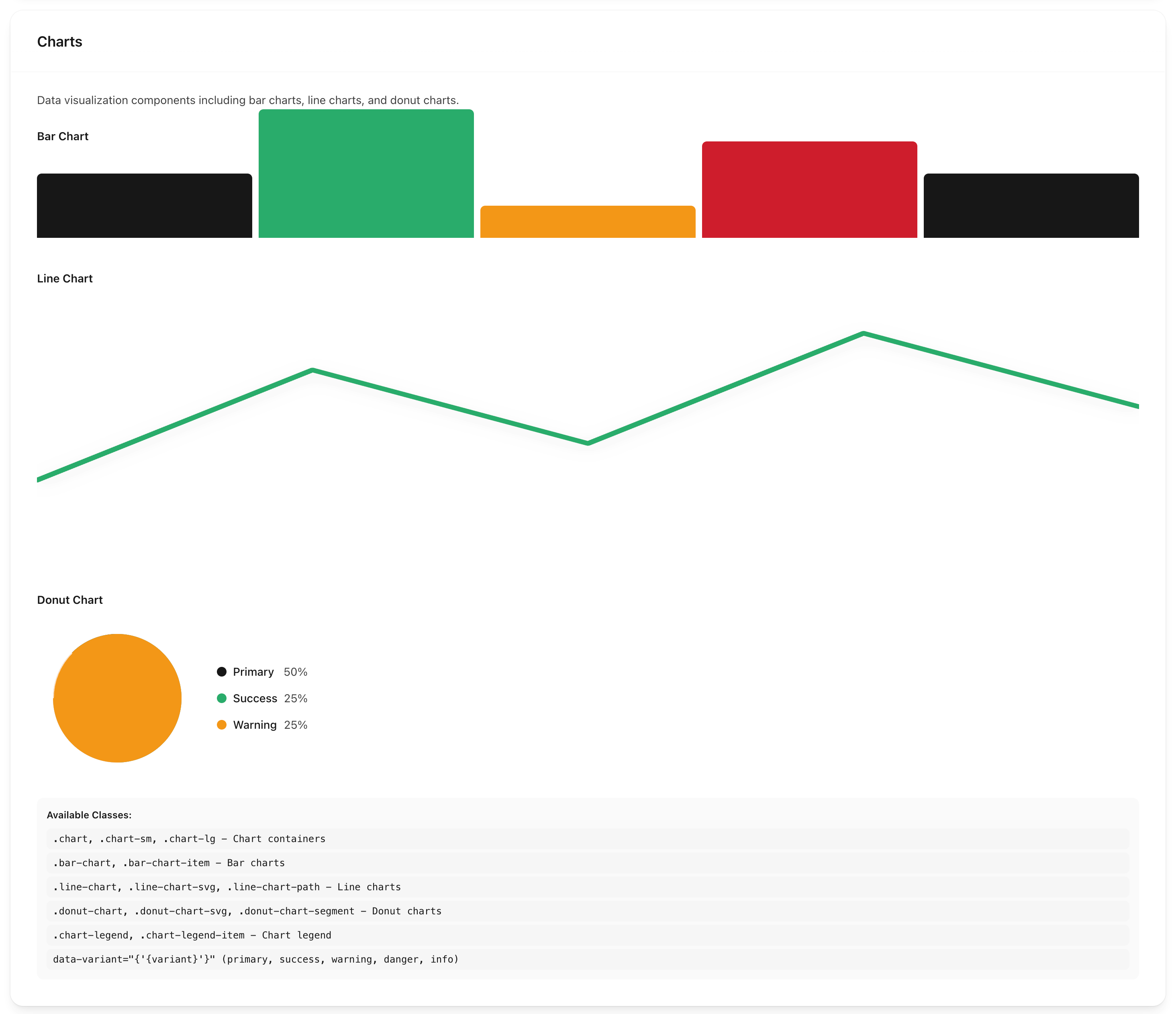
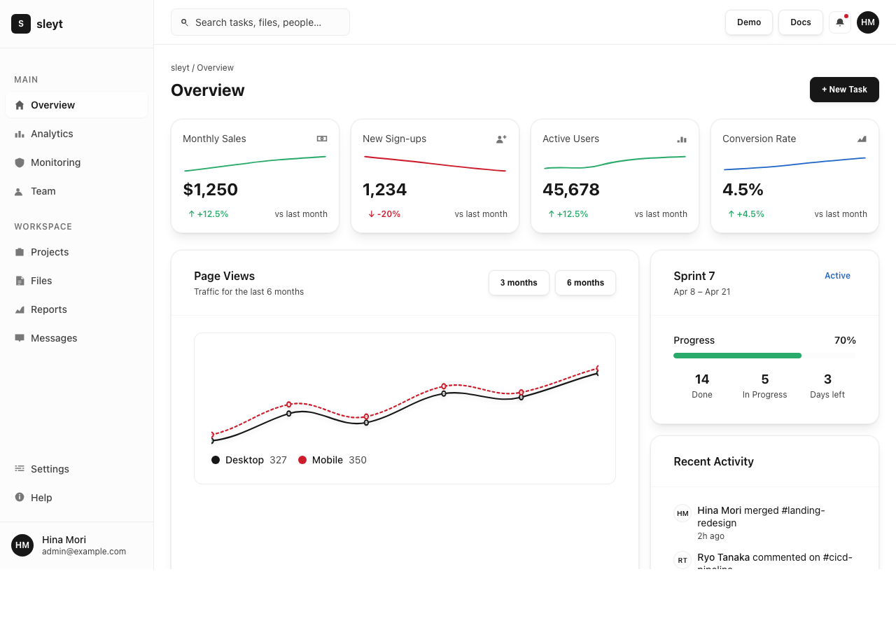
Data Visualisation
charts.css provides CSS-only bar charts, line charts, and donut charts — no JavaScript chart library required. Bar charts are pure CSS, using element height to represent data values.
Glass Morphism
Use .glass, .glass-light, .glass-heavy, and .frosted utility classes to add transparency and backdrop blur to any element. Stepped backdrop-blur utilities give fine-grained control over blur intensity.
Dark Mode
sleyt includes dark mode built-in, activating automatically via @media (prefers-color-scheme: dark). Component colours use CSS custom properties (variables), so overriding a palette takes a single-file change.
Accessibility
Component markup follows semantic HTML5 patterns. Colour contrast ratios target WCAG AA.
Installation
npm install sleyt
Then import in your CSS:
@import "sleyt/dist/css/index.css";
Or use the CDN — add this to your HTML <head>:
<link rel="stylesheet" href="https://unpkg.com/sleyt@latest/dist/css/index.css">
Demo
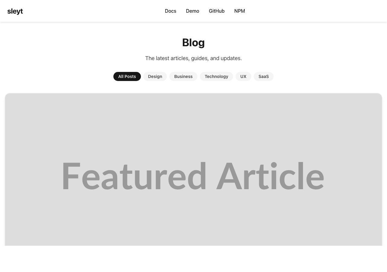
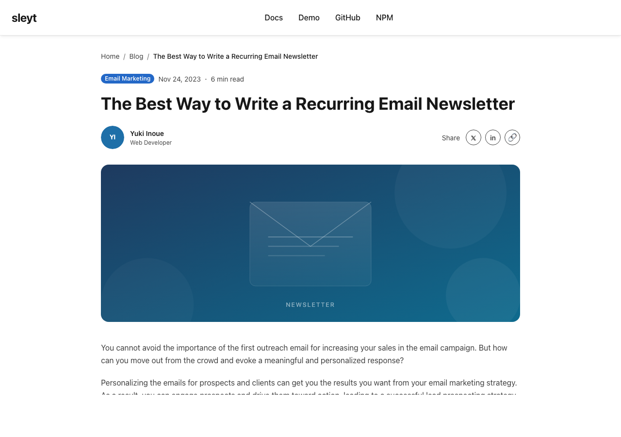
The demo page shows every component in context, including dark-mode variants and chart types. Three full-page demos — a blog listing, an article detail, and an admin dashboard — show how sleyt looks in realistic UI patterns.
Summary
sleyt is a lightweight CSS-only framework focused on readability and modern visual style. It runs on CSS alone, with no JavaScript runtime dependency.
- npm: sleyt
- GitHub: bmf-san/sleyt
- Demo: bmf-san.github.io/sleyt/demo.html